It’s summer time here in Copenhagen, and what better way to start your summer weekend than to get some interesting insights on the upcoming ClickLearn Attain? 

In today’s post we look at how we plan to retire the “book” and “shelf” objects, which you know so very well from the current version of ClickLearn, and replace them with a new structure editor. It will vastly improve the author user experience when configuring your learning portals, while also bringing in some important new possibilities. Let’s dive in and have a closer look!
In ClickLearn Attain you can structure your learning portal in the structure editor, using sections (any number and nested into any number of levels), line dividers, text parts and external links:
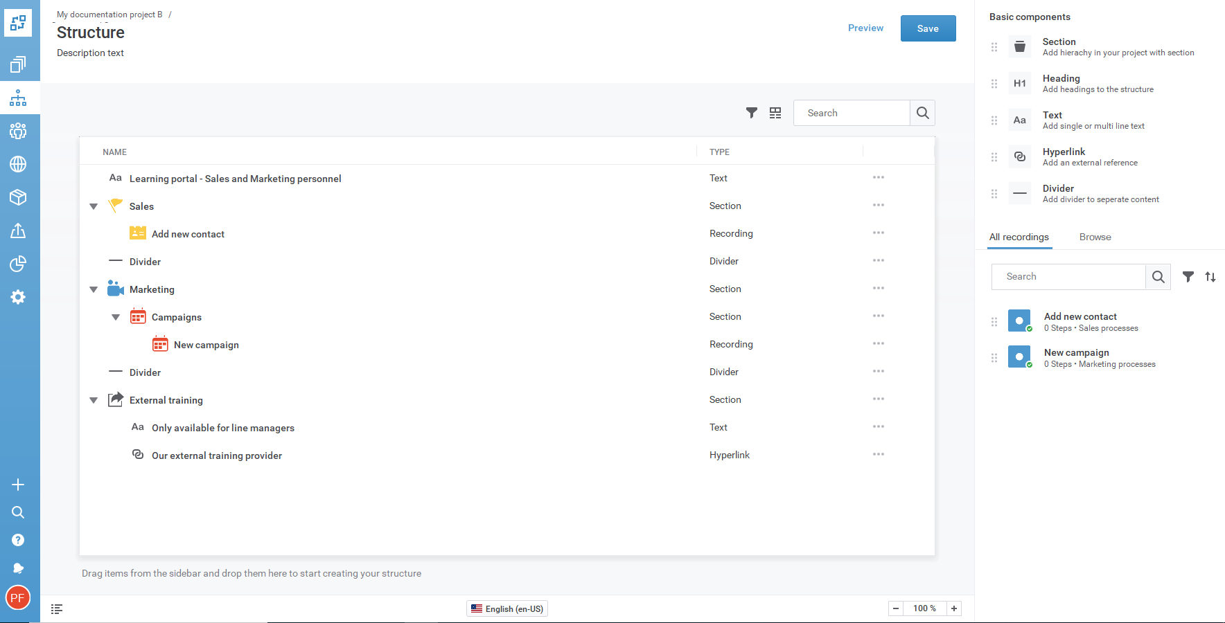
Some quick highlights: Unlimited levels (sections-in-sections), simple color-styling with multiple colors in the same learning portal, search-and-find or browse folders to easily add your recordings.
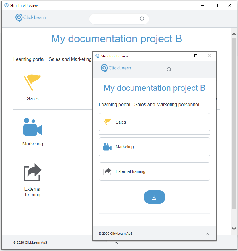
You can preview your learning portal by the click of a button, in an external, re-sizable window to quickly test desktop/mobile output:
What you think about the new way of working with structure in your learning portals? Also, let us know if you have a better name than “structure editor”. Write your thoughts in the comments below!

